Peak picking in multidimensional datasets
NMRglue provides a single function (ng.peakpick.pick) that can pick peaks in multidimensional NMR datasets. Currently, 4 algorithms are implemented (thres, fast-thres, downward, connected) that can be passed as an argument to the keyword algorithm in the function call.
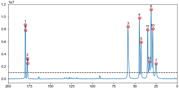
The code below reads previously processed datasets, picks peaks above a given threshold, and plots the spectrum with all the peaks marked. A unit conversion object is used to do the conversions from points to ppm.
import nmrglue as ng
import matplotlib.pyplot as plt

# read data
dic, data = ng.pipe.read("../integration/integrate_1d/1d_data.ft")
uc = ng.pipe.make_uc(dic, data)

threshold = 1e6

# detect all peaks with a threshold
peaks = ng.peakpick.pick(data, pthres=threshold, algorithm="downward")

# plot and indicate all peaks
fig, ax = plt.subplots(figsize=(8, 4), constrained_layout=True)
ax.plot(uc.ppm_scale(), data.real)

# add markers for peak positions
for n, peak in enumerate(peaks):
    height = data[int(peak["X_AXIS"])]
    ppm = uc.ppm(peak["X_AXIS"])
    ax.scatter(ppm, height, marker="o", color="r", s=100, alpha=0.5)
    ax.text(ppm, height + 5e5, n + 1, ha="center", va="center")

ax.hlines(threshold, *uc.ppm_limits(), linestyle="--", color="k")
ax.set_ylim(top=1.2e7)
ax.set_xlim(200, 0)

plt.show()
[figure]
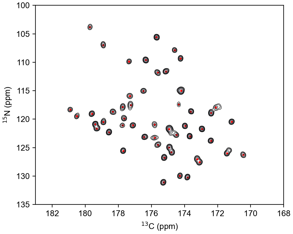
The function call for picking peaks spectra with dimensions > 1 is identical. Only the way you plot the spectrum and add peak annotations is different. A simple example is shown below
import nmrglue as ng
import matplotlib.pyplot as plt

# read data
dic, data = ng.pipe.read("test.ft2")
uc = {
    "n": ng.pipe.make_uc(dic, data, dim=0),
    "c": ng.pipe.make_uc(dic, data, dim=1),
}

threshold = 8.5e4


# detect all peaks with a threshold
peaks = ng.peakpick.pick(data, pthres=threshold, algorithm="thres", msep=[1, 1])


# contour levels and axes
ext = [*uc["c"].ppm_limits(), *uc["n"].ppm_limits()]
clevs = [threshold * 1.4 ** i for i in range(10)]


# plot and indicate all peaks
fig, ax = plt.subplots(figsize=(5, 4), constrained_layout=True)
ax.contour(data.real, levels=clevs, extent=ext, cmap="bone", linewidths=0.5)
ax.set_xlim(183, 168)
ax.set_ylim(135, 100)


# add markers for peak positions
x = uc["c"].ppm(peaks["X_AXIS"])
y = uc["n"].ppm(peaks["Y_AXIS"])
ax.scatter(x, y, marker=".", s=10, color="r")


ax.set_xlabel("$^{13}$C (ppm)")
ax.set_ylabel("$^{15}$N (ppm)")

plt.show()
[figure]
