2D visualization example
Introduction
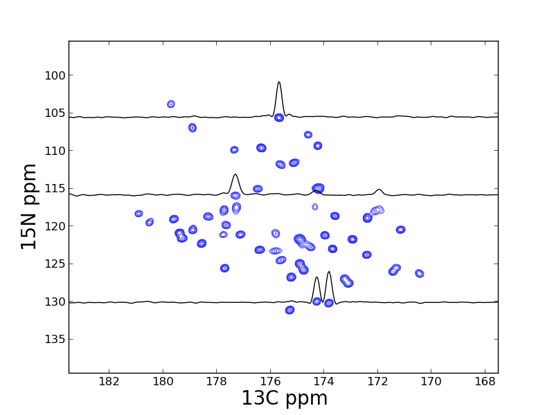
This example is taken from Listing S4 from the 2013 JBNMR nmrglue paper. In this example a 2D SSNMR spectrum is visualized using the script plot_2d_pipe_spectrum.py
Instructions
Execute python plot_2d_pipe_spectrum.py to visualize the data in the file test.ft. The resulting file spectrum_2d.png is presented as Figure 4 in the paper.
The data used in this example is available for download.
Listing S4
import nmrglue as ng
import matplotlib.pyplot as plt

# read in data
dic, data = ng.pipe.read("test.ft2")

# find PPM limits along each axis
uc_15n = ng.pipe.make_uc(dic, data, 0)
uc_13c = ng.pipe.make_uc(dic, data, 1)
x0, x1 = uc_13c.ppm_limits()
y0, y1 = uc_15n.ppm_limits()

# plot the spectrum
fig = plt.figure(figsize=(10, 10))
fig = plt.figure()
ax = fig.add_subplot(111)
cl = [8.5e4 * 1.30 ** x for x in range(20)]
ax.contour(data, cl, colors='blue', extent=(x0, x1, y0, y1), linewidths=0.5)

# add 1D slices
x = uc_13c.ppm_scale()
s1 = data[uc_15n("105.52ppm"), :]
s2 = data[uc_15n("115.85ppm"), :]
s3 = data[uc_15n("130.07ppm"), :]
ax.plot(x, -s1 / 8e4 + 105.52, 'k-')
ax.plot(x, -s2 / 8e4 + 115.85, 'k-')
ax.plot(x, -s3 / 8e4 + 130.07, 'k-')

# label the axis and save
ax.set_xlabel("13C ppm", size=20)
ax.set_xlim(183.5, 167.5)
ax.set_ylabel("15N ppm", size=20)
ax.set_ylim(139.5, 95.5)
fig.savefig("spectrum_2d.png")