plotting example: plot_1d_freq
This example shows how to use nmrglue and matplotlib to create figures for examining data or publication. In this example the spectrum from a 1D NMRPipe file is plotted.
The data used in this example is available for download.
#! /usr/bin/env python
# Create a 1D plot of NMRPipe data
import nmrglue as ng
import matplotlib.pyplot as plt
import numpy as np
# read in the data from a NMRPipe file
dic,data = ng.pipe.read("nmrpipe_1d/test.ft")
# create a unit conversion object for the axis
uc = ng.pipe.make_uc(dic, data)
# plot the spectrum
fig = plt.figure()
ax = fig.add_subplot(111)
ax.plot(uc.ppm_scale(), data, 'k-')
# annotate the figure
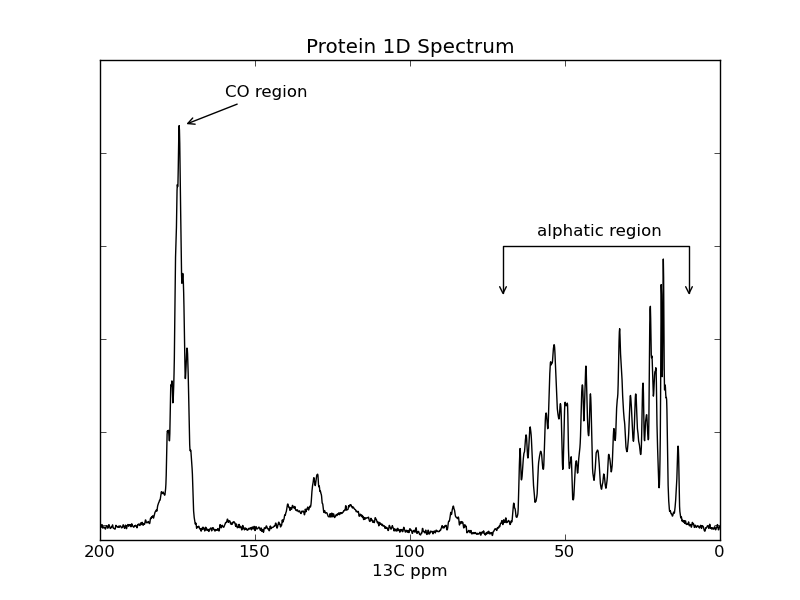
ax.annotate('CO region', xy=(173, 2.15e6), xycoords='data', xytext=(30,20),
textcoords='offset points', arrowprops=dict(arrowstyle="->"))
ax.text(59, 1.55e6, "alphatic region")
ax.annotate('', xy=(70,1.2e6), xycoords='data', xytext=(10, 1.2e6),
textcoords='data',
arrowprops=dict(arrowstyle="<->", connectionstyle="bar",
ec="k", shrinkA=5, shrinkB=5,))
# decorate axes
ax.set_yticklabels([])
ax.set_title("Protein 1D Spectrum")
ax.set_xlabel("13C ppm")
ax.set_xlim(200, 0)
ax.set_ylim(-80000, 2500000)
# save the figure
fig.savefig("spectrum.png") # this can be .pdf, .ps, etc
Results:
[figure]
