plotting example: plot_2d_spectrum_pts
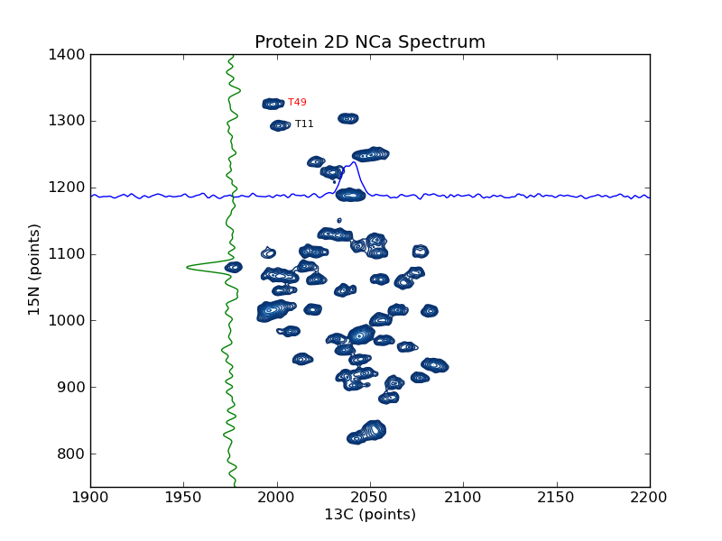
This example shows how to use nmrglue and matplotlib to create figures for examining data or publication. In this example a contour plot of the spectrum from a 2D NMRPipe file is created. Slices are added in the 15N and 13C dimension as well as sample peak labels. plotting example: plot_2d_spectrum is similar to this example but plotted on a ppm scale.
#! /usr/bin/env python
# Create a contour plot of a 2D NMRPipe spectrum

import nmrglue as ng
import numpy as np
import matplotlib.pyplot as plt
import matplotlib.cm

# plot parameters
cmap = matplotlib.cm.Blues_r    # contour map (colors to use for contours)
contour_start   = 30000     # contour level start value
contour_num     = 20        # number of contour levels
contour_factor  = 1.20      # scaling factor between contour levels

# calculate contour levels
cl = contour_start * contour_factor ** np.arange(contour_num)

# read in the data from a NMRPipe file
dic, data = ng.pipe.read("nmrpipe_2d/test.ft2")

# create the figure
fig = plt.figure()
ax = fig.add_subplot(111)

# plot the contours
ax.contour(data, cl, cmap=cmap,
            extent=(0, data.shape[1] - 1, 0, data.shape[0] - 1))

# add some labels
ax.text(2006, 1322, "T49", size=8, color='r')
ax.text(2010, 1290, "T11", size=8, color='k')

# plot slices in each direction
xslice = data[1187, :]
ax.plot(range(data.shape[1]), xslice / 3.e3 + 1187)
yslice = data[:, 1976]
ax.plot(-yslice / 3.e3 + 1976, range(data.shape[0]))

# decorate the axes
ax.set_ylabel("15N (points)")
ax.set_xlabel("13C (points)")
ax.set_title("Protein 2D NCa Spectrum")
ax.set_xlim(1900, 2200)
ax.set_ylim(750, 1400)

# save the figure
fig.savefig("spectrum_pts.png") # this can be .pdf, .ps, etc
Result:
